
One cozy Monday afternoon at the Curbside Splendor office, a fight breaks out. Scattered around hot tea and tiny succulents, three impassioned women realize they all write in different notebooks. They are angry about this and begin to defend their chosen notebook style. I scribble in the void of a multicolored Moleskine. Catherine Eves keeps her words in black ruled Moleskines and Meads. Naomi Huffman scales away her creativity in gridded Field Notes.
I get upset. “I would go crazy writing on a grid. Crazy,” I said.
“Well I don’t go crazy. I like it.” Naomi says. And there is silence.
Catherine breaks the pause through crunches of Sweet Tarts. “I gotta keep my words in line somehow.”
Writers can’t grab random scraps of loose leaf to get the words flowing. It’s a commitment thing: writers defend their utensils. Even in the age of Microsoft Office, a typeface and font size can make all the difference. In the computer and beyond, writing mediums are holy. To commemorate this holiness, I asked three authors in the Curbside fall catalog what they write with. Now I will arbitrarily analyze what their choices say about them as people. If I come across as judgmental, it’s because I am. Unlined, multi-colored Moleskines are without question the best tools in existence. They even beat the invention of the wheel. But for the sake of being well-rounded:
Dave Reidy, author of The Voiceover Artist
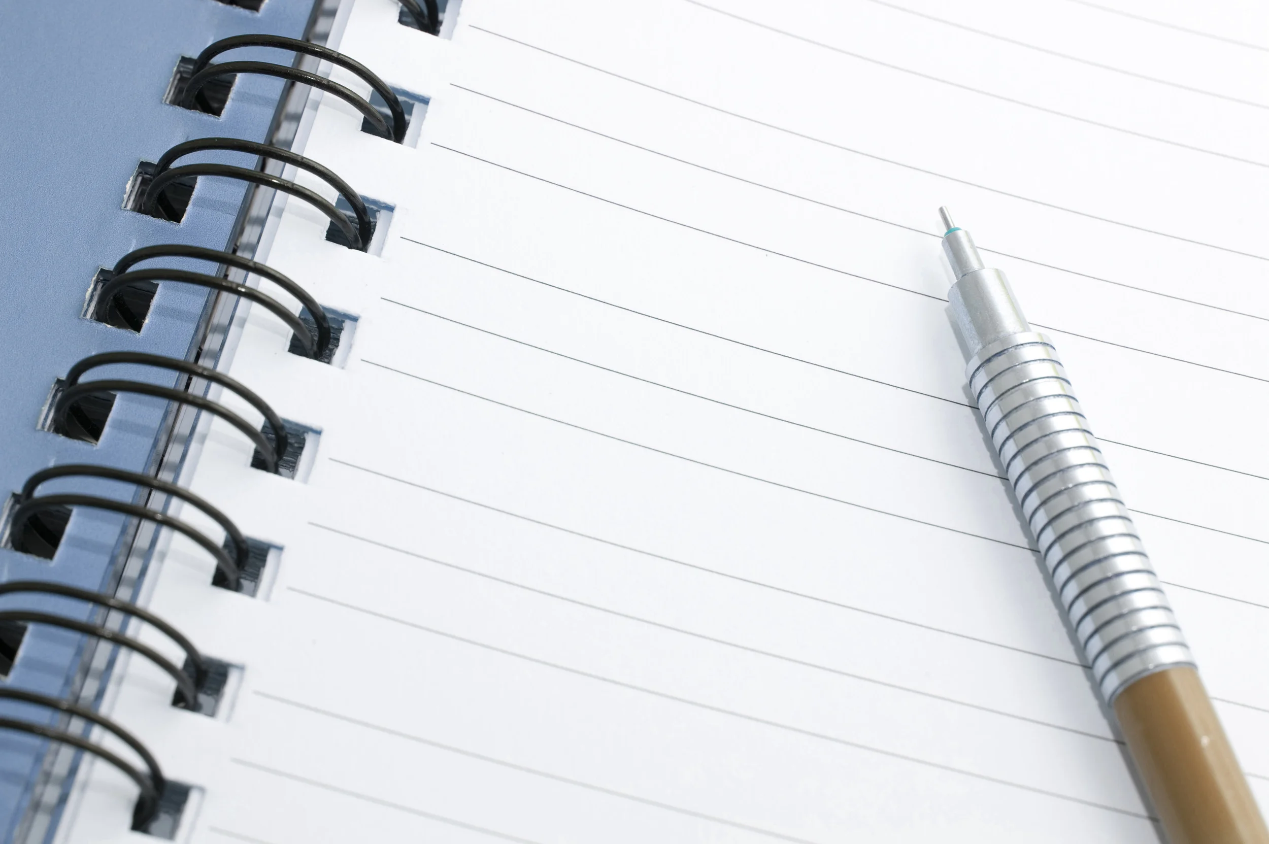
When Dave began writing The Voiceover Artist in 2007, he used a black spiral-bound Canson field journal. I associate Cansons with really cultured people. Whenever someone writes in one on the CTA, they mean business. I often spot Cansons at The Art Institute, clutched by serious people on benches as they journal about art. To me, a Canson writer is an easily inspired writer. I respect Dave for this. He also noted a highlight of the Canson is acid-free paper. Acid-free paper holds the ink better than acidic paper, where the words tend to rub out after awhile. Thank goodness for acid-free paper, otherwise Dave’s 2007 words would have been gonners.
My vendetta against the Canson is the ruled pages. I like when words float around without gravity. I guess Dave has a problem writing in a straight line . . . hee hee.
When it was time to get cracking on the computer, Dave turned to a Macbook “of 2008 vintage.” To keep things simple, he stuck with 12-point Times New Roman font. When he moved on to his new project, a memoir, he spiced up his font life with a new love: 13-point Helvetica. He also took his skills to cyberspace and began working through email. How a person can write through email, I don’t know, but I don't question his method of expertise. I trust Dave has his ducks in a row because he swears by “the least literary and most arithmetical of electronic documents,” the Excel Spreadsheet. I revere Dave for his commitment to Excel. When I sit before it, I sweat in panic.
I salute Dave for his willingness to experiment with many mediums rather than marrying just one. In this sense, he is polyamorous.
Vanessa Blakeslee, author of Juventud
Vanessa Blakeslee takes a more minimal approach. She composed the entirety of Juventud on her laptop, although she loves to write first drafts “longhand” with cedar pencils inside spiral notebooks. I put “longhand” in quotes because I am quoting her, obviously, but also to emphasize the exhaustion I feel when I think longhand. I jot in notebooks all the time, but when I think of writing full drafts longhand: that’s dedication. It’s a finger cramp waiting to happen. But to admire the use of cedar pencils, Vanessa doesn’t seem to get cramps at all. Pencils are both classic and classy. To picture Vanessa longhanding with cedar pencils in spiral notebooks is a beautiful thing.
“Pencil” comes from the Latin term penicillus, which means “little tail.” So basically, it’s a really adorable word, and not only are pencils cute; they are practical. The combo of graphite deposit (lead) and erasures is genius. An incentive to write whatever you want is to know it can disappear right after.
I wish I could sit down with Vanessa one day and get a penmanship lesson. Mine is a disaster and my intuition says hers is not.
Patrick Wensink, author of Fake Fruit Factory
Patrick gets even more retro than Dave with Microsoft Office 2007. He wishes his reasoning were sentimental: that he can’t leave 2007 behind after years of its support. But actually, Patrick is a professional writer which means he is “in a professional state of near-bankruptcy at all times.” When the going got tough, Word ‘07 was there for him . . . but when it comes down to it, he just didn’t want to pay for updated software. As artists we must choose our needs and wants. He has chosen to cut back on technological pursuits. Still, he can’t ditch a good friend after all that dedication. And Office 2007 has proven to be a good friend.
In terms of fonts, he enjoys the “vanilla” use of 12-point Times New Roman. Times New Roman is a buddy of vintage Office programs. Like Word 2007, Times New Roman has never failed him. It is cleaner than the “scribbles” of earlier drafts. Patrick didn’t specify his medium of “scribbles,” and I gather it is because he is embarrassed of his handwriting. Perhaps he should stick to his computer in all drafts.
As he put it, “Word ‘07 and I have settled into a nice comfortable marriage after eight years and I’m not one to rock the boat.”